"My mama always said Netflix is like a box of chocolates. You never know what you're gonna get."
Probably most prominent and obvious to analyze about Netflix is the Netflix Logo itself. It seems too simple, just the title on various backgrounds, but I have found it to be far more intriguing and important than that. The Netflix logo in itself isn’t just fascinating, but also the evolution of it as its audience changed. It is a mix of visual and text that manages to convey this company with a single word and a display in a very clever way. It’s all over the Netflix website and on all their original shows and in the corner of your screen when you open it. It perfectly placed to be there but never too obnoxious, just situated well enough so its forever ingrained in our heads, and the Netflix workers have only gotten better and better as a design team.
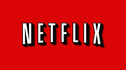
Wherever the design team of the original logo, I wish I could shake all their hands because wow, is their initial logo brilliant. The initial logo for Netflix was designed as block letters on a red screen. That’s it. But it easily means so much more. The letters were arched in a way to cleverly look like an old projected curve, and that only continues in the shadowing behind the white letters, making the entire title of Netflix to look like a projected movie on a screen. They only increase the brilliance of the logo by putting it on a red background, the same deep red of theater curtains, the kind they used at old movies, plays, musicals, and the same deep red they use for the red carpet. I mean, put movie projection letters and deep red colors and you can’t help but think of movies and Hollywood, right? They perfectly use pathos, connecting with our nostalgia for old Hollywood to attract us to their product. Netflix was practically showing off at that point, because their logo was a brilliant one to attract an audience of people who loved movies and wanted to watch a lot.
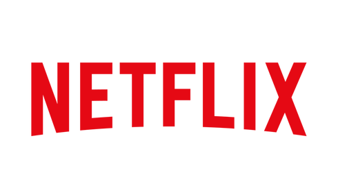
Now, the logo has taken a turn recently. The arch and deep red have been kept, but now the movie projection lettering has been abandoned and the background replaced. The letters now keep the Hollywood red and the backgrounds alter from white and black. Why would Netflix switch from such a seemingly perfect logo to a new one?
Wherever the design team of the original logo, I wish I could shake all their hands because wow, is their initial logo brilliant. The initial logo for Netflix was designed as block letters on a red screen. That’s it. But it easily means so much more. The letters were arched in a way to cleverly look like an old projected curve, and that only continues in the shadowing behind the white letters, making the entire title of Netflix to look like a projected movie on a screen. They only increase the brilliance of the logo by putting it on a red background, the same deep red of theater curtains, the kind they used at old movies, plays, musicals, and the same deep red they use for the red carpet. I mean, put movie projection letters and deep red colors and you can’t help but think of movies and Hollywood, right? They perfectly use pathos, connecting with our nostalgia for old Hollywood to attract us to their product. Netflix was practically showing off at that point, because their logo was a brilliant one to attract an audience of people who loved movies and wanted to watch a lot.
Now, the logo has taken a turn recently. The arch and deep red have been kept, but now the movie projection lettering has been abandoned and the background replaced. The letters now keep the Hollywood red and the backgrounds alter from white and black. Why would Netflix switch from such a seemingly perfect logo to a new one?
Because the design team at Netflix is disturbingly brilliant, that’s why.
They are fully aware they have changed from a movie renting business to a movie and show streaming company who is working on producing their own content for their site as well. They are also aware that their demographic has shifted from an older generation who would be drawn to old movie nostalgia to a younger one who likes more technology and all things streamlined. You think they don’t know about how college kids binge Netflix and joke about “Netflix and chill”? Netflix so totally knows, and they are using it to their advantage.
They still use their Hollywood-loving roots with the arch and color, but now for their fresher look they have an easily marketable, easily branded logo of increased simplicity. However beautiful the old logo was, it wasn’t the easiest brand to put on their new shows and movies and website. Nor is it as technologically and simply appealing to our tech-obsessed generation. They used ethos and logos more in this logo to attract their viewers. They may still respect their former look but now go for a logical approach. An approach that also gives them more credibility as a creator of movies and shows by making its title look more like a network or production company than a simple movie distributor. Netflix knows how to design, and are so totally okay with the fact their streaming had an accidental side-effect of addiction and binge-watching that the young masses are easily susceptible too. And they have no shame using it. Those evil geniuses.
